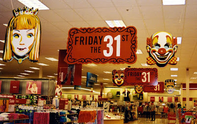
 2003 will go down in history as a legendary year for vintage Halloween lovin' folk like myself. 'Twas the year that my all-time favorite design house created the visual identity for Target Store's Halloween campaign. The brilliant geniuses at Charles Spencer Anderson's Minneapolis offices spent two years culling imagery from Hallow's Eves past (most notably, the iconic vacuform masks from the 60s and 70s) and weaving them into masterworks of contemporary eye candy.
I'll never forget the day I walked into Target and beheld the five-foot, three-dimensional Frankenstein mask hanging from the ceiling; the very same one I wore in 1981. I could see a trail of gorgeous signage and more masks leading the way back to the Halloween department. My body responded with a classic jaw drop. Being an artistic type I felt the ache that occurs when I see something that I dearly wish I could have had a creative part in. It's a purely bittersweet feeling to appreciate something so profoundly, while somehow growing angry that it even exists. Yes, I'm aware that I'm talking about signs in a discount store.
My first inclination was: must... get... giant... mask. I strolled up to the service desk and played it real cool like.
"Say, there miss. Can you tell me what's to become of these decorations?"
"Yes, they will be donated to local schools."
LIAR! I thought to myself.
As someone with extensive knowledge of elementary schools (I attended for over 6 years) I can confidently say that no school is cool enough to hang up giant masks such as these. Well, I left the service desk that afternoon figuring that I would never own these masks, and that the very notion was simply too good to be true. But guess what? I was absolutely right! I never got my hands on even one. Meanwhile, some middle school janitor is using a giant black cat mask as an ashtray. This is the sort of world we live in people! A terrible, terrible place where things are not as they should be.
Anyway, I eventually returned to the store with my camera and proceeded to take pictures until I was asked not to. And so I will now take these photos, the "we prefer that you don't take photos" photos, and I shall display them for the entire world to see! Well, well. Looks like I am the victor this time Target. Check-mate. It has taken me four years, but vengeance is now mine! ha! ha! ha! ha! ha!


And here are a bunch more painfully beautiful promotional images from CSA design..

Note: In another of Target's devious schemes, the awesome Frankenstein shirt seen above only came in kids sizes. To Target's delight, many grown men currently own a shirt that was made for children. Maybe I am one of them.
(EDIT: Rozum proved that adult sizes do indeed exist. So I guess I've been wearing around a boys XL for nothing. Sigh.)


 Cheers to CSA design. Jeers to Target and the public school system.
(You can read about someone who was lucky enough to get one of these masks in this post.)
And if you liked the visuals in this post then you will likely "freak out" when you see this CSA designed book...
UPDATE: You can also check out some pics of their 2005 campaign here. (thanks to Dan Goodsell)
And you can see a 2001 "Halloveen" commercial here. (thanks to Fred Neck)
Sunday, October 14, 2007
THE CSA HALLOWEEN
 10:01 PM
 mateng
Subscribe to:
Post Comments (Atom)
 RSS Feed
0 comments:
Post a Comment