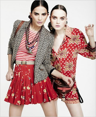
The New York Times included a Print Mixology feature in their April 14th issue that I found to be quite an interesting little read... Now I'm sure many of you are already aware of/read this piece; however, for those of you who have not, take a sec and check it out. I absolutely love these photos and tips for mixing prints so much that I deem them worthy of a repeat performance. And now, with no further ado, five sage guidelines for dressing this season:
- Vary the scale. Mix a small neat print with a splashier one. Or an eye-popper with one that’s more neutral.
- Stay within the same color family.
- Mix up the fabrics, the weights — a rough-textured fabric with a more refined one. Somehow a nubby, slubby fabric pairs up more naturally with a flat weave than do two smooth-textured fabrics.
- Toss in some polka dots, stripes or even leopard prints, which are easier to mix with other patterns because they’re simple and graphic. And they’re familiar to the eye.
- Consider the accessories. Though it’s fun to tote a print bag with a print frock, you can tone down the brights with a great tan leather bag or pair of sandals. Straw works, too.
Images courtesy of the NY Times
 RSS Feed
 2:35 PM
 mateng


0 comments:
Post a Comment